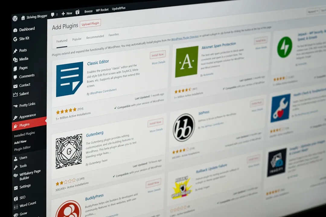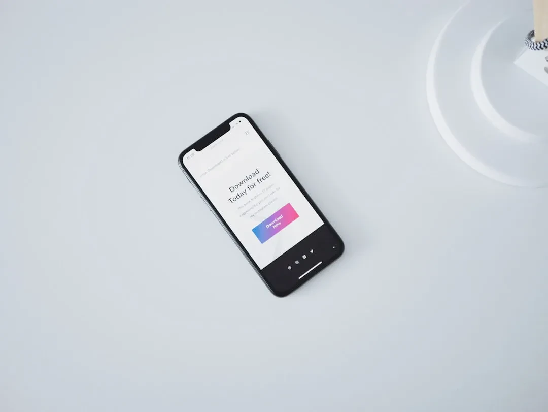
Your site looks perfect on desktop, but on a phone it's unreadable. Tiny text, columns breaking out of screen, buttons too small to tap. We see this often in projects coming to us: a design made for wide screens, poorly adapted to mobile. At Meteora Web, we've been using the mobile-first approach for years, and with Tailwind CSS it becomes natural. It's not a trend — it's how you build a site that truly sells or converts. In this guide, we show you the why and the how, with real code examples you can copy right away.
Why Mobile-First? The Traffic Reality
Over 60% of global web traffic comes from mobile devices. If your site isn't designed for that small screen first, you're losing visitors — and potential customers. Mobile-first means starting from the narrowest viewport (phone) and then adding rules for larger screens. With Tailwind, this is built right into the classes: any utility without a breakpoint prefix applies to all screens. Then you add sm:, md:, lg: prefixes to override when needed.
The practical benefit? You don't need to write media queries manually, you never forget to reset properties. Tailwind follows the mobile-first principle by default: base classes always apply, prefixed classes only activate from that width upward.
Tailwind's Breakpoints: Know Them to Use Them
Tailwind defines five default breakpoints, all mobile-first (min-width):
/* Tailwind default values */
sm: 640px   /* >= 640px */
md: 768px   /* >= 768px */
lg: 1024px  /* >= 1024px */
xl: 1280px  /* >= 1280px */
2xl: 1536px /* >= 1536px */
You can customize them in tailwind.config.js, but defaults cover most projects. The rule: never think in terms of "up to what", always "from what upward". For mobile styles, write without prefix; for tablet add md:, for desktop lg:.
Using Breakpoints in Practice: Working Examples
Responsive Text
Want a title small on mobile, medium on tablet, large on desktop?
Responsive Title
On mobile (< 768px): text-2xl. From 768px (md) up: text-3xl overrides. From 1024px (lg) up: even larger. No manual media queries.
Grid: 1 Column on Mobile, 2 on Tablet, 3 on Desktop
  Card 1
  Card 2
  Card 3
Mobile: 1 column. From 768px: 2 columns. From 1024px: 3 columns. gap-4 stays same across viewports.
Show/Hide Elements
Often you want a hamburger menu only on mobile and full navigation on desktop:
Note: block md:hidden means "block by default, hidden from md up". hidden md:flex means "hidden by default (mobile), flex from md up". Works perfectly, no JavaScript required for basic toggle.
Variable Spacing and Padding
Content with growing padding
On mobile tight padding, on desktop more breathing room.
Organizing CSS with Mobile-First: Best Practices
When building complex components, always start with base classes for mobile, then add prefixed versions. Here's a pattern we use in our projects:
  Text
  Image
On mobile: vertical column, image on top (order-1), text below. On tablet+: horizontal row, text left, image right. All with just a few classes, zero custom CSS.
If you must write custom CSS (rare with Tailwind), always use min-width media queries in the same order:
.my-component {
  @apply p-4 text-base;
}

@media (min-width: 768px) {
  .my-component {
    @apply p-8 text-lg;
  }
}
Never use max-width unless absolutely necessary — it breaks the mobile-first pattern.
Common Mistakes and How to Avoid Them
- Using only high breakpoints without a base: If you only write
lg:text-xland nottext-base, on mobile the text will have no defined size (inheriting default). Always set a base. - Mixing up prefixes: Remember:
sm:activates from 640px, not before. If you want a style valid up to 639px, write the base class and thensm:...to change it. - Not testing on real devices: Browser dev tools simulate, but nothing beats a real phone. At Meteora Web, we always test on iPhone, Android, and tablets before going live.
- Forgetting responsive images: Images need to scale. Use
max-w-full h-autoor object-cover utilities. Tailwind doesn't handle that magically — you have to apply it.
In Summary — What to Do Now
- Check your CSS: If you have media queries with
max-widthor desktop-first styles, start reversing the order. Tailwind already forces you into mobile-first. - Rewrite one component using the mobile-first pattern: Pick a product card or header and rewrite it with Tailwind classes: no prefix for mobile, then add
md:andlg:for larger screens. - Test on a narrow screen (375px) with the browser: Open dev tools, select an iPhone emulator, and verify everything is readable and tappable. If not, apply missing base classes.
- Customize breakpoints in your project: Edit
tailwind.config.jsif you need specific points (e.g., 900px for tablets). But first ask: do you really need them? Defaults cover 90% of cases. - Remember: SEO rewards mobile-first. Google indexes the mobile version. A site that loads well on phones and has a clear structure ranks better. We see it in our clients' results.
Mobile-first is not optional. With Tailwind it becomes so simple you'll wonder why you didn't do it earlier. If you have an existing project to adapt or want to start from scratch, we at Meteora Web can help. But above all: start writing for the phone first. The desktop will follow.
Sponsored Protocol