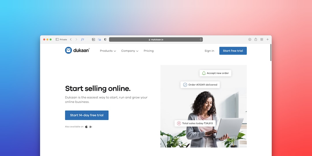
You spent time and money building your ecommerce, but visitors come, look, and leave without buying. It's not the product's fault. It's the experience that doesn't convince them. We, at Meteora Web, see this every day: slow images, scattered information, a checkout that looks like a tax form. The average customer decides in seconds whether to trust or flee. This guide starts from real problems and gives you solutions you can apply right now. No abstract theory — just the way we've worked for over 8 years with Italian SMEs, from retail to digital craftsmanship.
Why is ecommerce UX measured in revenue, not compliments?
A beautiful site isn't enough. If the product page doesn't answer the customer's questions in 3 seconds, they leave. If the checkout takes more than two clicks to reach payment, they abandon. We call this friction cost. Every second of loading, every unnecessary field, every unresolved doubt is a cost you pay in abandoned carts. A client of ours had a clothing ecommerce with images at 4 MB each. We optimized them, reducing file size by 60% without quality loss. Product page load time dropped from 5 to 1.8 seconds. Conversions increased by 12% in one month. That's UX that generates revenue.
How to optimize the product page to boost conversions?
The product page is your digital storefront. It must answer three questions: What is it, why do I need it, and why should I trust you? Here's how to structure it, step by step.
Images and videos that sell
Use sharp images with zoom, multiple angles, and a short video of the product in use. Recommended size: 1200×1200 pixels, WebP format, max 200 KB. We often use tools like cwebp from the terminal or automatic compression plugins. Avoid intrusive watermarks — they look like barriers, not quality marks.
Title and description focused on benefit
The title should include the product name and key benefit. Example: «Premium linen shirt — breathable and wrinkle-free». The short description (below the price) answers the «why buy it». The long description (in a tab or section) explains technical features, materials, care. Use bullet points for features, but tell a story for the benefits.
Clear price and availability
Display the price prominently, with any discount crossed out. Indicate availability with messages like «In stock — ships in 24/48 hours». If out of stock, offer a notification option. No mystery.
Call to action that drives action
The «Add to Cart» button must be colored, large, and clearly visible. Direct text: «Add to Cart» or «Buy Now». Avoid «Continue» or «View Cart». Place it right below the price, not at the bottom of the page.
Schema markup for Google
Add JSON-LD markup for your product. It helps Google display stars, price, and availability in search results. Here's a working example:
{
  "@context": "https://schema.org/",
  "@type": "Product",
  "name": "Premium linen shirt",
  "image": "https://yourdomain.com/image.webp",
  "description": "Breathable, wrinkle-free linen shirt.",
  "sku": "CAM123",
  "offers": {
    "@type": "Offer",
    "url": "https://yourdomain.com/product/shirt",
    "priceCurrency": "EUR",
    "price": "59.90",
    "availability": "https://schema.org/InStock"
  }
}
Many WooCommerce plugins generate this automatically, but verify your data using Google's Rich Results Test.
Which checkout elements reduce cart abandonment?
The checkout is where up to 70% of customers are lost. We've worked on dozens of ecommerce sites and isolated three critical factors.
Minimize steps
More fields and pages mean more abandonment. Use a single-page checkout or at most two: shipping details and payment summary. Ban mandatory registration: always offer a guest checkout. Registration can be suggested after purchase, not before.
Progress indicators and trust messages
Show a progress bar (Step 1 of 3). Display secure payment icons (Visa, Mastercard, PayPal) and a visible SSL badge. We, at Meteora Web, automate SSL certificates using Let's Encrypt with auto-renewal after solving a case where an expired certificate took a client offline.
Optimized fields and autofill
Use clear placeholders, not floating labels. Enable browser autocomplete with the autocomplete attribute. Separate first and last name only if needed for shipping. Ask for VAT only if required for invoicing.
Transparent shipping and returns
Show shipping cost before payment. Offer a real-time calculator. Clearly state the return policy: «Free returns within 30 days» is a powerful trust signal.
How to build trust signals that really work for Italian SMEs?
Trust isn't bought with nice graphics. It's built with concrete signals the customer recognizes at a glance.
Verified reviews displayed prominently
Integrate a review system (e.g., Google Customer Reviews or Trustpilot). Show ratings directly on the product page and during checkout. Reviews with photos are twice as valuable. Warning: no fake reviews. Fabricated reviews are discovered and destroy your reputation.
Security and payment badges
In addition to SSL, show logos of accepted payment methods. If you use PayPal, add the «Buyer Protection» badge. If you have a recognized security certificate (e.g., VeriSign, Sectigo), display it in the checkout footer.
Reassuring content
Include an FAQ section on the product page, answering common doubts: delivery times, sizing, returns. Add a phone number or a quick contact form. We saw conversion rates increase by 15% on a handmade jewelry ecommerce after making the phone number visible on every page.
Social proof and urgency
Show how many people have purchased the product in the last few hours (e.g., «23 people bought this today»). Use timers for limited-time offers, but only if genuine. Fake urgency? The customer notices and never returns.
What to do now
We've covered a lot, but the next step is yours. Here are three concrete actions to take today:
- Check your product page speed with tools like PageSpeed Insights. If load time exceeds 2 seconds, optimize images and enable server caching.
- Review your checkout by navigating it on mobile as if you were a customer. How many clicks to complete an order? Reduce to a maximum of 2 pages.
- Add at least one trust signal today: an SSL badge, a highlighted review, or a phone number. Small changes generate big impacts on revenue.
For a deeper dive, we have a dedicated guide on choosing between WooCommerce and Shopify for Italian SMEs. We, at Meteora Web, work every day to turn visitors into customers. If you need concrete support, we're here.