Today, a website can be a complex e-commerce platform, an interactive web app, or a streaming service. But history began much more humbly, with a text page designed to explain what the Web itself was. The
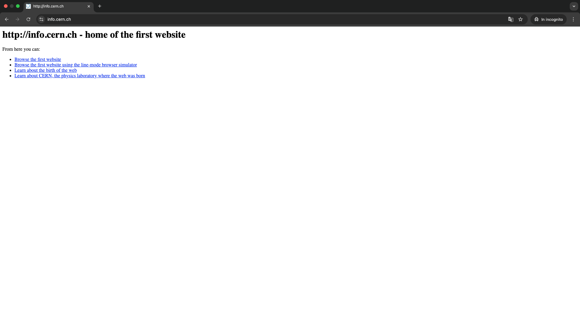
first website in history lived at the address info.cern.ch, on the servers of CERN in Geneva, and resembled a technical datasheet more than a modern homepage.
Behind that page was the work of Tim Berners-Lee and the team that was imagining a distributed system for sharing information among researchers. No banners, no full-width images, no grid layouts. Just text, links, and an implicit promise that soon anyone could publish their own space on the Web. A line that, thirty years later, also runs through projects hosted on advanced infrastructures like
Meteora Web Hosting.
What Was the First Website Like
Visually, the first website was disarmingly simple. Light background, black text, blue underlined hyperlinks. No images, no large CERN logo, no graphic elements interrupting the flow of lines. The layout was a central column of text that felt closer to a manual than what we would call a web page today.
The HTML code was equally essential. Few tags, including headings, paragraphs, and links. No CSS, because style sheets would only arrive years later. No JavaScript, no frameworks. The browser displayed exactly what it was given, without sophisticated interpretations. Yet that page already contained the key idea of the modern Web: using clickable links to move from one document to another.
Looking at it today, the first site might almost seem like a "broken" page, lacking the aesthetic polish we are accustomed to. But for those seeing it for the first time, it was the equivalent of a window opening onto a new way of organizing knowledge—more flexible than linear documents and more immediate than the closed architectures of old systems.
What That Page Really Contained
The first site did not showcase products, collect leads, or tell a brand story. It did something more radical.
It explained what the World Wide Web was, how it worked, and how anyone, in theory, could participate. It was a kind of manual in the form of a web page, discussing protocols, formats, and tools.
The text described the fundamental elements of the project. The concept of distributed hypertext, the difference between server and client, the role of links in connecting documents even when hosted on different machines. There were instructions on how to install a server, how to get a browser, how to contribute new content. In other words, that page was simultaneously a showcase, technical documentation, and an open invitation to collaborate.
One of the most interesting aspects is precisely this operational tone. The site did not take a passive audience for granted. It addressed potential participants, researchers, and technicians who could replicate the model, host pages themselves, and help the network grow. The Web was born this way, as a shared infrastructure, not as a packaged product to be consumed.
Those working on complex digital projects today can find in that page some elements that have remained central. Attention to content structure, clarity in defining objectives and functions, and the awareness that without good documentation even the best technology risks remaining incomprehensible.
What That First Site Still Teaches Us
Looking back at the first website in history is a good antidote to today's graphic fetishes. It reminds us that the Web was not born to amaze, but to
make information accessible. There were no special effects, yet its impact on digital culture has been enormous. That prototype paved the way for everything that followed, from blogs to social platforms, from corporate sites to the web apps we use every day.
There is also a lesson in balance. Form matters, and projects like those curated by Meteora Web demonstrate how crucial user experience is for a modern site. But form loses meaning if it does not serve clear content and a thoughtful structure. The first site was practically all substance, and perhaps that is precisely why it has stood the test of time as a historical reference.
Finally, that site puts into perspective the speed at which the ecosystem we now take for granted has grown. From a text page on a CERN server to millions of sites hosted on global infrastructures, managed via control panels, CDNs, caching services, and hosting environments like Meteora Web Hosting. The leap is immense, but the basic principle remains the same. A client requests a resource, a server responds, a link leads elsewhere.
Remembering what the first site was like and what it contained is not just about nerdy nostalgia. It helps us design the present with greater awareness, avoiding losing sight of what truly makes the Web useful. Good information, accessible, connected, and designed for those who will read it—whether it's a spartan page in pure HTML or a complex portal built with the most modern technologies.