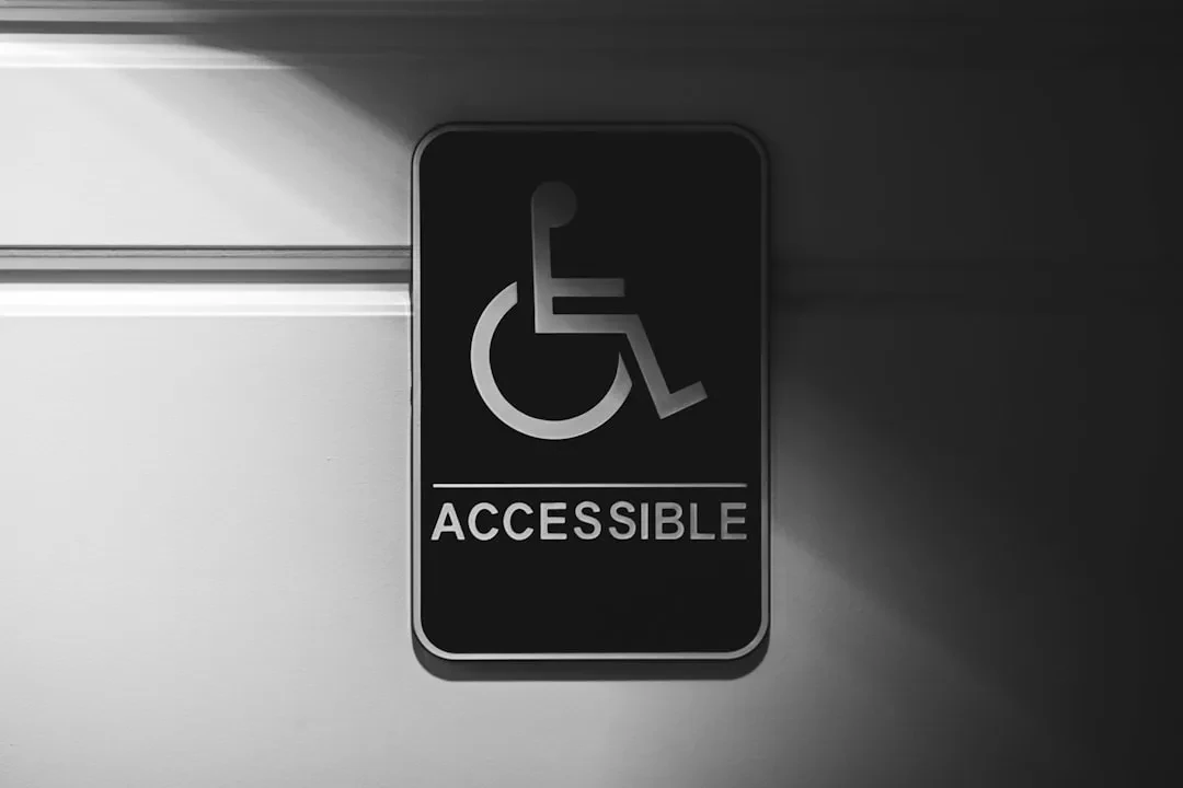
Your website is excluding people. Every day, users with visual, motor, or cognitive disabilities fail to complete a purchase, fill out a form, or read an article on your site. This isn't a niche issue: over 1 billion people worldwide have a disability, plus aging populations, keyboard-only users, and slow connections. If your site isn't accessible, you lose customers, risk legal penalties, and ignore a massive market. At Meteora Web, we build projects daily, and accessibility is not an option — it's a technical, legal, and commercial requirement.
What is web accessibility and why it matters to you
Web accessibility means designing and developing sites and apps that everyone can use, regardless of ability. It's not just about “helping the blind”: it covers keyboard navigation for people with tremors, color contrast for low vision, captions for the deaf, and simplified reading for dyslexia. An accessible site is a more usable site for everyone.
Legal obligations (EU & Italy): The European Web Accessibility Directive (2016/2102) and Italy's Legge Stanca require public sector bodies and certain private entities (e.g., e‑commerce above revenue thresholds) to meet WCAG 2.2 Level AA. Since 2025, enforcement has expanded. Even if you're not legally bound, accessibility is a huge competitive advantage.
The business case: Accessible sites rank better in SEO (semantic headers, alt text, clear structure), reduce bounce rates, and increase conversions. We see it daily: well‑labeled forms convert more, clear navigation cuts cart abandonment.
Action step: Check if your business falls under the legal requirements. Public sector? Already mandated. E‑commerce? Prepare — obligations are coming.
WCAG 2.2: the four principles (POUR) and conformance levels
The Web Content Accessibility Guidelines 2.2 are the global standard. They're built on four principles:
Sponsored Protocol
- Perceivable: All content must be presentable in ways users can perceive. Example: images have alt text, videos have captions.
- Operable: Interface must be navigable by different inputs (keyboard, voice, touch). Example: all buttons are reachable via Tab.
- Understandable: Content and UI must be clear. Example: form errors are explained in plain text.
- Robust: Content must be interpreted by a wide range of user agents, including screen readers. Example: valid, semantic HTML.
Three conformance levels: A (minimum), AA (recommended, legally required in the EU), AAA (highest, hard to achieve site‑wide). We aim for AA everywhere and AAA on critical pages (checkout, contact). WCAG 2.2 adds criteria like visible focus, pointer access, and accidental input prevention.
Action step: Download the WCAG 2.2 AA checklist from W3C and compare it against your key pages. Identify low‑hanging fruit: missing alt text, forms without labels, broken keyboard navigation.
Semantic HTML: the foundation of effortless accessibility
HTML isn't just a design cage. Using the right tags gives screen readers the page structure. <nav> for navigation, <main> for primary content, <h1> to <h6> for heading hierarchy, <button> for actions (not a clickable <div>).
Common mistake: using <div> and <span> everywhere, then adding ARIA roles to compensate. Wrong: native semantic HTML is more robust and requires less code.
Example – a navigation menu:
<nav aria-label="Main navigation">
  <ul>
    <li><a href="/about">About us</a></li>
    <li><a href="/services">Services</a></li>
    <li><a href="/contact">Contact</a></li>
  </ul>
</nav>
Action step: Audit your HTML. Ensure every page has one <h1>, logical heading order, and interactive elements are native buttons or links.
Sponsored Protocol
ARIA: roles, properties, and states – when to use them (and when not)
WAI‑ARIA provides attributes to fix the meaning of HTML elements when native markup isn't enough. Three pillars: roles (what is this?), properties (what characterizes it?), states (its current condition).
Golden rule: don't use ARIA if native HTML works. Example: use <nav> instead of <div role="navigation">. ARIA is for dynamic components: tabs, accordions, dialogs, sliders, autocomplete.
Practical example – an accordion panel:
<button aria-expanded="false" aria-controls="panel1">More info</button>
<div id="panel1" role="region" aria-labelledby="buttonID" hidden>
  <p>Panel content.</p>
</div>Warning: bad ARIA can break accessibility. We've seen role="button" on a <span> without tabindex – a dead zone for screen readers.
Action step: Check custom interactive components in your site. Verify they have correct ARIA attributes using the browser's accessibility audit.
Keyboard navigation: focus management and skip links
Many users don't use a mouse – motor disabilities, voice control, or preference. Your site must be fully operable with Tab, Shift+Tab, and Enter.
Visible focus: WCAG 2.2 requires a clear focus indicator (outline, color change) on every interactive element. Never set outline: none without replacement.
Skip link: the first element after <body> should be a “Skip to content” link that moves focus to <main>. Example:
Sponsored Protocol
<a href="#main-content" class="skip-link">Skip to main content</a>and CSS:
.skip-link {
  position: absolute;
  top: -40px;
  left: 0;
  background: #000;
  color: #fff;
  padding: 8px;
  z-index: 100;
}
.skip-link:focus {
  top: 0;
}
Focus trapping: when a modal opens, focus must move inside and stay trapped. On close, return focus to the triggering element.
Action step: Navigate your site using only the keyboard. Can you reach all links and buttons? Do you see a focus ring? If not, add skip links and restore focus outlines.
Color contrast: WCAG ratio and testing tools
Contrast between text and background is vital for low‑vision users and bright outdoor reading. WCAG 2.2 AA requires at least 4.5:1 for normal text (below 18px / 14px bold) and 3:1 for large text (18px bold+ or 24px+). UI components (buttons, input borders) need at least 3:1 against adjacent background.
Tools: WebAIM Contrast Checker, Chrome DevTools contrast section. Don't trust your eyes — measure.
Example: light gray #999 on white has ~2.8:1, too low. Use at least #767676 to reach 4.5:1.
Action step: Use Chrome's color picker to check contrast of your text. Adjust colors where they fail. Also check link underlines against surrounding text.
Accessible images: descriptive alt text and decorative images
Every image needs a meaningful alt attribute. For decorative images (borders, backgrounds, purely aesthetic icons) use alt="" (empty) so screen readers ignore them. For informative images, describe the content concisely but fully: not “product photo” but “Blue wool V‑neck sweater, detail of seams”.
Complex images: charts, infographics, maps. Provide a longer description in adjacent text or via longdesc.
Sponsored Protocol
Bad example: <img src="logo.png" alt="logo" />. Better: <img src="logo.png" alt="Meteora Web – digital agency Sicily" />.
Action step: Review all images on your site. Are decorative ones marked with empty alt? Do important ones have descriptive alt? If you’ve never checked, they’re likely missing.
Accessible forms: labels, error messages, and autocomplete
Forms are the heart of many sites (contact, registration, checkout). Every input must have an explicit <label> linked via for and id. Don't rely on placeholder alone – it disappears when typing, breaking screen reader understanding.
Error messages: must be descriptive and placed near the field, not just at the top. Use aria-describedby to associate the message with the input.
Autocomplete: add the autocomplete attribute with appropriate values (e.g., autocomplete="email") to help users with cognitive disabilities and those using autofill.
Example of an accessible email field:
<label for="email">Email address</label>
<input type="email" id="email" name="email" autocomplete="email" required aria-describedby="email-error" />
<span id="email-error" role="alert">Please enter a valid email.</span>
Action step: Check that every input has an explicit label, placeholders aren't the only description, and error messages are visible and readable by screen readers.
Screen reader testing: NVDA, VoiceOver, and JAWS
No automated audit can replace actual screen reader testing. Top tools:
- NVDA (Windows, free) – most popular. Shortcut: NVDA key + Down arrow to read content.
- VoiceOver (macOS/iOS) – built in. Activate with Cmd+F5.
- JAWS (Windows, paid) – common in enterprise and government.
Navigate your site with NVDA. Listen for headings announced correctly, links read properly, form instructions clear. You’ll often discover hidden text (e.g., an “X” icon without alt) or missing landmarks.
Sponsored Protocol
Action step: Download NVDA (free) and spend 30 minutes navigating your three most important pages. Take notes on what doesn't work.
Accessibility audit: automated tools and remediation plan
No single tool catches everything. We use a layered approach:
- Automated audit: Chrome Lighthouse (extension or DevTools) gives a first pass on contrast, alt attributes, structure. axe DevTools (free) is more thorough.
- Code validation: W3C HTML Validator and WAVE from WebAIM.
- Manual testing with keyboard and screen reader as above.
- Remediation plan: rank issues by impact (critical = blocks navigation) and effort, fix in priority order.
A typical SME plan: fix keyboard navigation first (skip links, focus), then forms (labels, errors), then contrast and images, finally dynamic components.
Action step: Run a Lighthouse audit on your homepage. Download the report and fix at least five accessibility issues this week.
In summary – what to do now
Accessibility is not a one‑off project; it's a continuous process. Here are concrete actions to start today:
- Run an audit with Lighthouse and axe on your main pages.
- Check keyboard navigation: add skip links and visible focus.
- Review alt text for images and labels for forms.
- Verify color contrast with WebAIM.
- Test with NVDA to hear the real user experience.
At Meteora Web we design and develop accessible sites from the first line of code. If you need a consultation or a full audit, contact us. Remember: a site that excludes is a site that fails.