 Ing. Calogero Bono
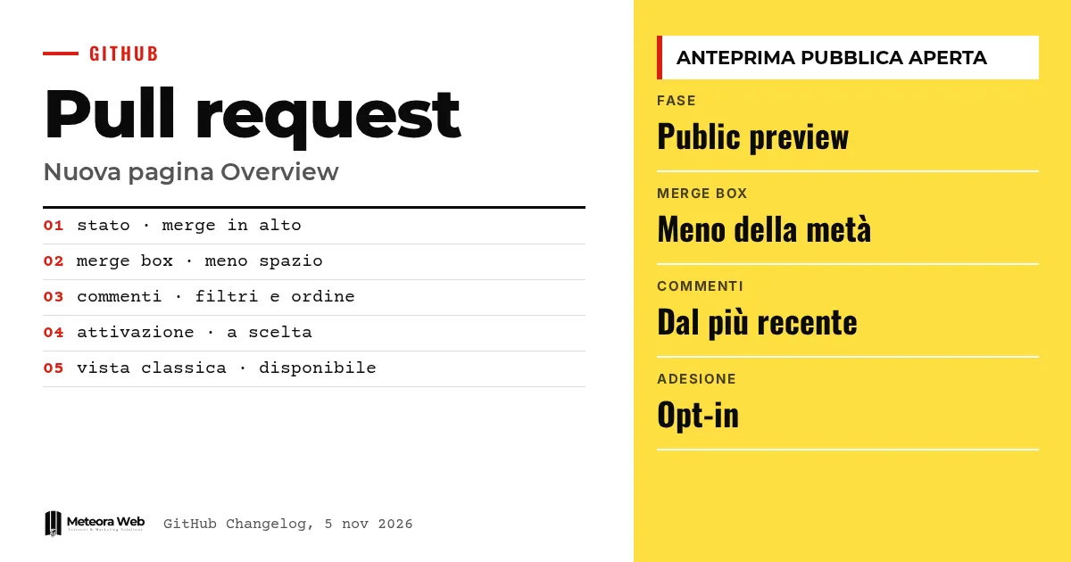
GitHub has started the public preview of the new Overview page for pull requests. It is opt-in, and according to the announcement the rollout continues over the weekend. It brings the merge status and the available actions to the top, in a compact summary. It matters because anyone reviewing many pull requests loses time scrolling through comments and events before understanding what is blocking the work.
A few terms before we get into the facts. Pull request is the request to merge the changes of a branch into the main code. Merge box is the panel where GitHub shows whether the request can be merged. Checks are automated controls, for example tests. Public preview is a phase in which the feature is open to everyone but still in development. Branch is the working branch of the code.
What is the pull request Overview page?
According to GitHub's official announcement, it is a new pull request view, offered as a preview to those who choose it. It puts a progress summary at the top, so you no longer have to scroll down to the merge box.
GitHub presents it as the first step of a broader rethink, aimed at making pull requests easier to follow as code, conversations and reviews change.
How does the merge box change?
GitHub says it has redesigned it to show the same information in less than half the space. It is not just moved higher up.
- A compact view of checks, comments and approvals keeps the context within reach.
- You can act on what is blocking, for example by updating the branch.
- You can see whether the request is ready and merge it once the requirements are met.
From the summary you can then follow the useful detail, such as failed checks, who still has to approve, or the relevant comments.
How do you follow comments more easily?
The preview introduces some tools to find your way through the thread.
- Filters for unresolved conversations or for comments you wrote yourself.
- Sorting from newest to oldest.
- A summary in the top right to find review comments, review requests and other updates.
From the header you can also mark a draft as ready for review or close the pull request, depending on your permissions.
How do you try it and go back to the classic view?
Just select the "Try the Overview page" button, with the sparkle icon, in the pull request header. From the same menu you can return to the classic view during the preview.
GitHub invites you to try it on your next pull request and to say what is easiest to find, where you still lose context, and what makes you switch back to the classic view. Feedback goes in the dedicated discussion. If you want to review your workflow, you can start with our guide to pull requests and code review.
Limits to know
For now we only have GitHub's announcement. There are no independent measurements of the time saved, and the claim about the merge box taking half the space comes from the company itself. No plans, general availability dates or future changes are indicated. GitHub itself describes the preview as "a starting point", so the interface may change based on feedback.
What changes for those working in digital
If you review code every day, the summary can shorten the step from understanding what is blocking to knowing what to do next. It is useful in teams with many open requests. Try the view on a couple of real pull requests without forcing it on everyone, since it can be turned off. If you work with branch protection rules and automated tests, it is worth checking that the checks are readable in the new summary. A solid setup of automated tests makes this view more useful.
Our take
It is a small but well-targeted change. Code review has become the bottleneck for many teams, partly because the volume of changes to check keeps growing, as GitHub's work on coding agents shows. Making the status of a request immediately clear is more useful than many new features. It remains to be seen whether the summary holds up on long and complex pull requests, where the risk is trusting a summary too much.
Frequently asked questions
Is the new Overview page available to everyone?
No, it is an opt-in public preview. GitHub mentions a rollout that continues over the weekend. To get in you use the button in the pull request header.
Can I go back to the classic view?
Yes. During the preview, the same menu used to opt in lets you return to the classic view.
What does the new merge box show?
It shows merge status and available actions in a compact form. It includes a view of checks, comments and approvals. GitHub says it takes up less than half the space of before.
Can I filter comments?
Yes. You can view only unresolved conversations or comments you wrote yourself. You can also sort from newest to oldest.
Where do I leave feedback?
In the discussion dedicated to the Overview page preview, linked by GitHub in the announcement. The company asks you to report what is easiest to find and where you lose context.
What to watch in the coming weeks for GitHub pull requests
The preview is the start of a broader rethink. It is worth watching how it evolves and whether it holds up in everyday use.
- Check whether GitHub announces new parts of the experience beyond the merge box.
- Compare review times with your team before and after using the new view.
- Follow the reports in the feedback discussion to understand which limits emerge.